Friday, August 8, 2008

Floor Plan


A floor plan is a architectural map drawn to scale to show the relationships between rooms, spaces, and other physical features at one level of a structure. Dimensions are usually drawn between the walls to specify room sizes and wall lengths. Floor plans will also include details of fixtures like sinks, water heaters, furnaces, etc. Floor plans will include notes to specify finishes, construction methods, or symbols for electrical items.
http://www.oaksriverside.com/homepage.php

Terminal Area Chart

Terminal area charts are used in US and Canadian aviation. These are aeronautical charts used for navigation under Visual Flight Rules that show areas surrounding major airports. These charts depict topographic features and other information of interest to aviators flying visually, including major landmarks, terrain elevations, visual navigation routes, ground-based navigation aids, airports, rivers, cities, and airspace boundaries.

http://www.megascenery.com/vol3-us-full-V2.htm

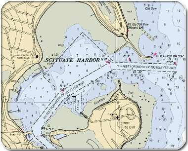
Nautical Chart

Nautical charts map maritime areas and surrounding coastal regions. Most nautical charts like the one above show depths of water and heights of land, seabed features, and navigational hazards. Some charts also show tides, currents, harbours, buildings, and bridges.


Thursday, August 7, 2008

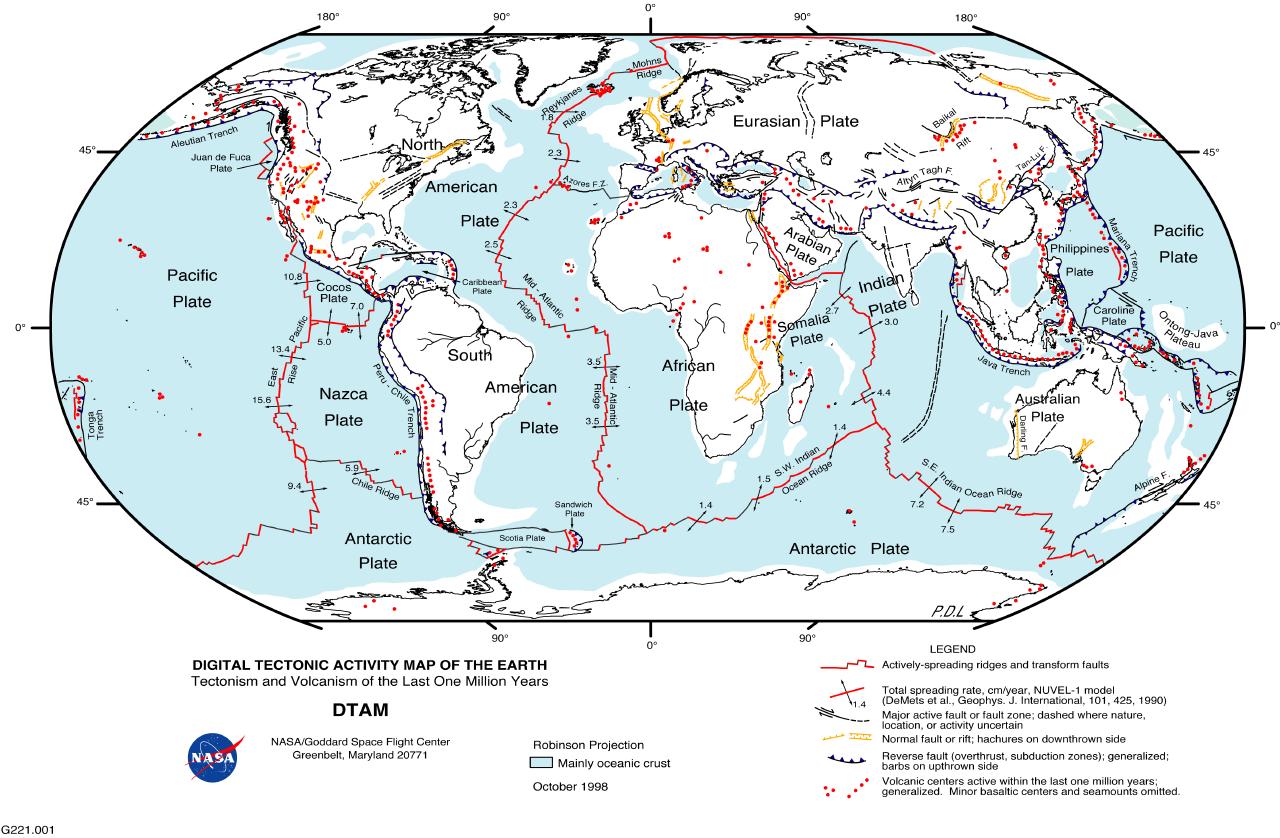
Tectonic Map


A tectonic map is a representation of structural elements related to the tectonic history of the upper crust of a planetary body. The different structural areas and their separate elements such as faults and folds are shown by various symbols; when combined with a geologic map, data regarding the age and type of rocks comprising the structural elements are given, along with their development over time.

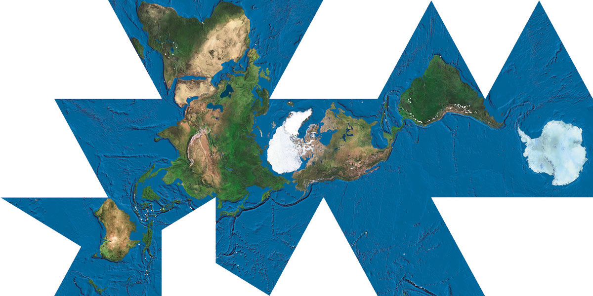
Dymaxion Map


The Dymaxion map is a map projection onto the surface of a polyhedron which can be unfolded in many ways and flattened into a two-dimensional map. This map retains most of the relative proportional integrity of the globe map.


Pictoral Map


A pictorial map depicts a given territory with a more artistic style. The cartography can be a sophisticated 3-D perspective landscape or a simple map graphic that includes illustrations of buildings, people and animals.

Geologic Map


A geologic map shows geological features. The stratigraphic contour lines are drawn on the surface of a selected deep stratum so that they can show the topographic trends of the strata under the ground.

Albedo Map


An albedo map shows the measured difference in surface reflectivity from the surface of celestial body. The albedo of an object is the extent to which it diffusely reflects light from the sun.

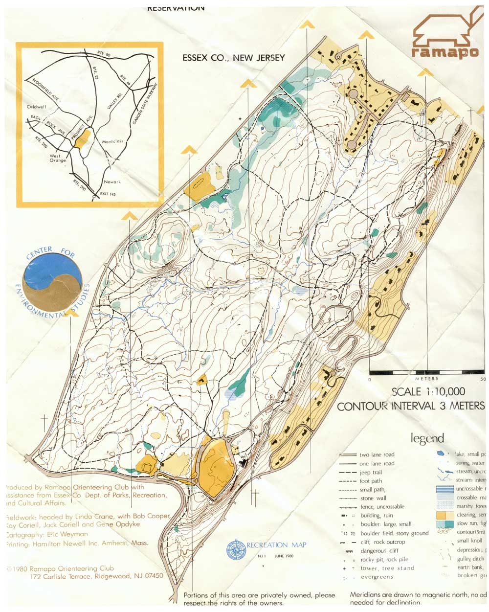
Orienteering Map


An orienteering map combines both general and thematic elements, designed for a very specific user group. Most of the characteristics of orienteering maps are related to those found on hiking and general use maps produced by the government.

Population Profile


A population profile is a chart showing the number of people as a function of their ages. The profile above charts three different time periods and was made by the US Census Bureau.

Wind Rose


A wind rose gives a view of how wind speed and direction are typically distributed at a particular location. Presented in a circular format, the wind rose shows the frequency of winds blowing from particular directions.


http://www.srs.gov/general/pubs/ERsum/data01.html

Climograph


A climograph is a graphical depiction of monthly precipitation and temperature conditions. Precipitation is shown by a bar on a graph while a line graph depicts temperature.

Scatterplot


A scatterplot displays values for two variables for a set of data. The data is displayed as a collection of points, each having the value of one variable determining the position on the horizontal axis and the value of the other variable determining the position on the vertical axis.

http://psyc.queensu.ca/~frostlab/sun98.html

Triangular Plot


A triangle plot is a graph of 3 variables which sum to a constant. It graphically depicts the ratios of the three variables as positions in an equilateral triangle.

Parallel Coordinate Plot


A parallel coordinates plot is a graphical data analysis technique for plotting multi-variable data. A set of parallel axes are drawn for each variable. Then a given row of data is represented by drawing a line that connects the value of that row on each corresponding axis.

http://www.palgrave-journals.com/ivs/journal/v6/n2/fig_tab/9500151f22.html

Stem and Leaf Plot


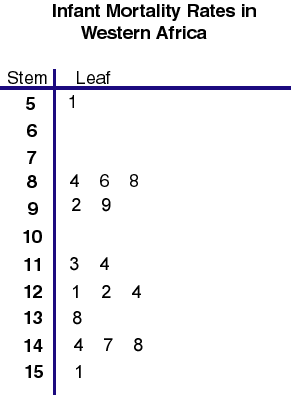
Stem and leaf plots displays data to show its shape and distribution. The data is arranged by place value. The digits in the largest place is referred to as the stem and the digits in the smallest place are referred to as the leaf (leaves).

Star Plots


A star plot is a method of displaying multi variable data. Each star represents a single observation. The star plots above show the crime rates in different US cities.

Correlation Matrix

A correlation matrix is a graphical representation of the correlation between two numeric variables. The matrix above shows the correlation between excess tax returns and the S&P 500 through different investment companies.

DOQQ


A Digital Orthophoto Quarter Quadrangle (DOQQ) is a digital raster image of an aerial photo mapped by the USGS. In a DOQQ, image displacement caused by terrain relief and camera tilt has been removed. This is a DOQQ of a portion of Washington D.C.

DLG


Digital Line Graphs (DLGs) are digital vector representations of cartographic information derived from USGS maps and related sources. This DLG includes raster text.

Isopleth Map


Isopleth lines connect measurements of equal value. They may of equal temperature (isotherms), pressure (isobars), altitude or almost any other measurement including precipitation and snow cover. This map shows ballistics data from the Miyaki-jima volcano eruption in Japan in 2000.

Isopach Map


Isopach lines on a map are contour lines that connects points of equal thickness. This map is of Bexar County, Texas and shows the thickness of sand and formations in the area.

http://www.lib.utexas.edu/geo/balcones_escarpment/pages145-152.html

DRG


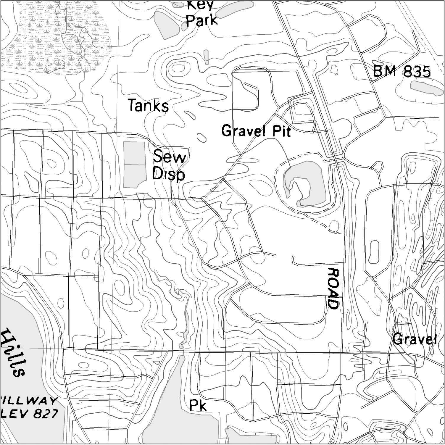
A digital raster graphic (DRG) is a scanned image of a U.S. Geological Survey (USGS) standard series topographic map that includes collar information. Collar information is the original border information of the map. This DRG is from a portion of Illinois.

Isohyet Map


This is a 1975 map of India showing isohyet lines. These lines join points of equal precipitation on a map. Isoheyts are generally measured in millimeters

http://www.unu.edu/unupress/unupbooks/80391e/80391E03.htm

Isotach Map


This map shows isotach lines in the Southeast. Isotach lines are lines of equal or constant wind speed. Wind speeds are represented in knots.

http://weather.cod.edu/help/700help.html

Isobar Map


This is a map with isobar information for Australia. Isobars are lines of equal atmospheric pressure drawn on a weather. Isobars are generated from mean sea-level pressure reports and are represented in millibars.

http://www.queenstown.com/weather.html

Black and White Aerial Photo

This is a black and white aerial photo of the town and adjacent areas of Ridgway, Colorado in 2005. The image allows viewers to see the terrain and the outlying topography of the area better because aerial photographs show the texture of the ground in much greater detail than do maps.

http://www.town.ridgway.co.us/comp_plan_maps.htm


Choropleth Map


This choropleth map shows the percentage of Hispanic population per county in Florida based on Census data from 2000. The map provides an easy way to visualize how the Hispanic population varies across the state.

Wednesday, August 6, 2008

Similarity Matrix

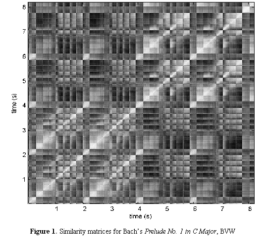
This similarity matrix shows Bach's Prelude No. 1 in C Major. This matrix expresses the similarity of distance between measures of Bach's work.

http://www.rotorbrain.com/foote/papers/icme2001/icmehtml.htm

Box Plots


These box plots show web hits for a particular website. The line going up shows the upper quartile of hits while the lower line shows the lower quartile. The box in the middle is the median range of hits.

DEM


This digital elevation model (DEM) shows the shoreline imagery of Oahu, Hawaii. The image shows the terrain of the island using relief.

Histogram

This histogram shows the distribution of salaries of the Acme Corporation. The interval scales helps the reader visualize the scale of the data while having the bars touch shows continuous data.

Lorenz Curve

This Lorenz Curve shows the degree of income inequality in Scotland. The percentage of households is plotted on the x-axis and the percentage of income on the y-axis. The straight line shows perfect equality of income vs population.

Dot Distribution Map

This dot distribution map shows historically active volcanoes with red dots. This map helps shows where there is a concentration of volcanoes around the world. This map helps the reader understand that volcanoes are generally found around the edges of tectonic plates.

http://images.google.com/imgres?imgurl=http://www.geophysics.rice.edu/plateboundary/volcano.72.gif&imgrefurl=http://scidiv.bcc.ctc.edu/rv/208/links07.html&h=792&w=1224&sz=40&hl=en&start=5&um=1&tbnid=RvoJ8FY0CpQSqM:&tbnh=97&tbnw=150&prev=/images%3Fq%3Ddot%2Bdistribution%2Bmap%26um%3D1%26hl%3Den

Propaganda Map


This propaganda map claims that China discovered the Americas before Christopher Columbus. The use of Chinese markings makes claims that Zheng He sailed around he world around 1418, finding the Americas along the way.


Infrared Aerial Photo


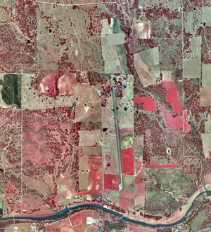
This is an infrared aerial photo of Lyndon B. Johnson National Historical Park. Colors are used to show different areas of the picture. Generally red tones in color infrared aerial photographs are associated with live vegetation and the tone of red can be used to monitor the density and health of the vegetation.

Doppler Radar


This doppler radar image is of hurricane Claudette in 1993. The radar picks up the radial velocity of the storm and shows an in depth picture of rainfall and directional motion of the storm within the radar's reach.

Flow Map


This flow map uses color, shading, and directional lines to show the flow of air traffic at King County International Airport in relation to their Fly Quiet program. The directional lines show where an airplane will fly over noise sensitive areas so that the pilot will know where he/she would need to follow the Fly Quiet regulations.

Isoline Map


This is an isoline map that uses continuous lines to join points of the same value. This map uses isotherm lines and color/shading to show high temperatures across North Carolina on January 31, 1981.

Proportional Circle Map

This is a proportional circle map that shows American Indian Population in various states based on Census Bureau data. You can see from the legend how each circle represents a population number. As the circles size increases, so does the population.

http://cache.search.yahoo.net/search/cache?ei=UTF-8&p=proportional+circle+map&fr=yfp-t-501&u=www.neiu.edu/%7Enerobert/Cartography.htm&w=proportional+circle+circles+map+maps&d=YttYDRg5RKVu&icp=1&.intl=us

Hypsometric Map


This is a map of France with hypsometric tinting. Different colors are used to show elevation changes so that the reader can see the area's relief.


PLSS Map

This is a Public Land Survey System base map for the state of Washington. Land is divided into 6-mile square townships that are then divided into 36 one-mile square sections. Markers are usually posted at each section corner, but they are not marked in the map.


http://welcome.warnercnr.colostate.edu/class_info/nr502/lg3/graphics/plss_basemap_washing.gif

Mental Map


This is a mental map of a town that was drawn from one's memory. It has a frame and labels like most maps, but is inaccurate in scale. It does not have all aspects of the town on the map as well.

Friday, June 27, 2008

KML File

This KML file is from teh NOAA website and represents the National snow analysis for January 31, 2008. I zoomed in on the Rocky Mountain region to get greater detail.

http://www.nohrsc.noaa.gov/earth/archive.html

Wednesday, June 11, 2008

LIDAR


LIDAR (light detection and ranging) is a laser-based imaging system that displays high-accuracy, high-density elevation data. This LIDAR image was from September 15, 2001 after the 9-11 tragedy and shows a 3-D model of the elevation of New York City in relation to the destruction/debris from the attack. Several of these images were taken over a span of several days to show the change in elevation of the destruction.

Statistical Map


A statistical map uses colors and legends to display statistical information and ranges for the information being analyzed. In this statistical map, the United States Census Bureau is trying to show where the most population change in both metropolitan and micropolitan areas in the United States has changed over a 5 year period. Using the shading from lightest to darkest to indicated the lowest to highest amount of population change and the legend to reinforce the statistical numbers, the chartographer was effective in conveying his or her message.

Cartogram


A cartogram is a map where area is not preserved and instead another thematic mapping variable is substituted for land area. The map is distorted in order to project the information of this other variable. In this cartogram, the earth's continents are distorted in order to portray each area's consumption in relation to the rest of the world. The distortion and coloring in the map is a way to more accurately display a particular area's "footprint" on the world.


Tuesday, June 10, 2008

Cadastral Map


This is a digital cadastral map of an area in Australia. These maps provide a cartographic record of official land surveys and subdivisions in an area. This map shows parish boundary lines, individual land plats, and roads in this area.

Friday, May 23, 2008

Thematic Map


This thematic map includes its the legend and scale of the map to show crime levels in Arkansas, Mississippi, and Louisiana river counties from lowest to highest. The coloring/shading on the map shows the spatial variation across the states relating to the crime levels in the affected counties.